


range 타입 input HTML 엘리먼트 스타일링
0. 들어가면서
input HTML 엘리먼트를 range 타입의 디자인을 커스터마이징(customizing)하는 방법에 대해 정리했다.
1. Terminology
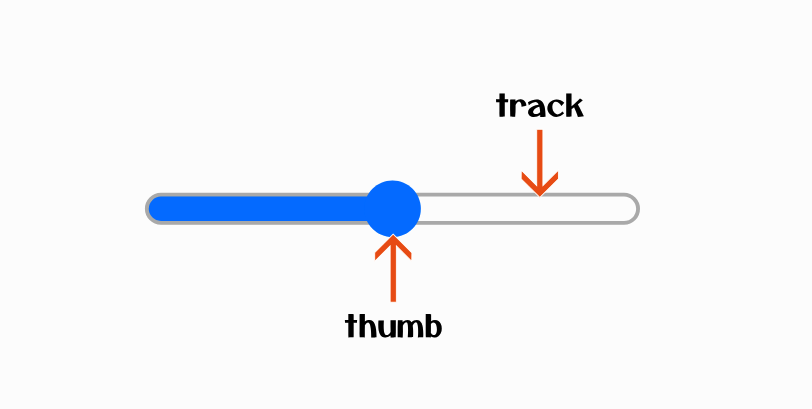
range 타입 input HTML 엘리먼트를 구성하는 요소들에 대한 용어를 먼저 정리해보자.
- thumb
- 슬라이더의 값을 변경할 수 있는 포인터 요소이다.
- track
- 슬라이더의 thumb 포인터가 움직일 수 있는 영역이다.
- input 엘리먼트에 지정된 min, max, step 값에 따라 thumb 요소가 멈추는 구간과 지정된 값이 달라진다.
2. Cross browser issue
range 타입 input HTML 엘리먼트는 크로스 브라우저(cross browser) 문제가 있다. 브라우저마다 자동으로 색이나 모양을 지정하기 때문에 외형이 다르다.
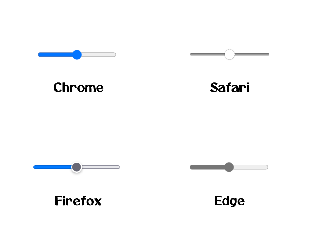
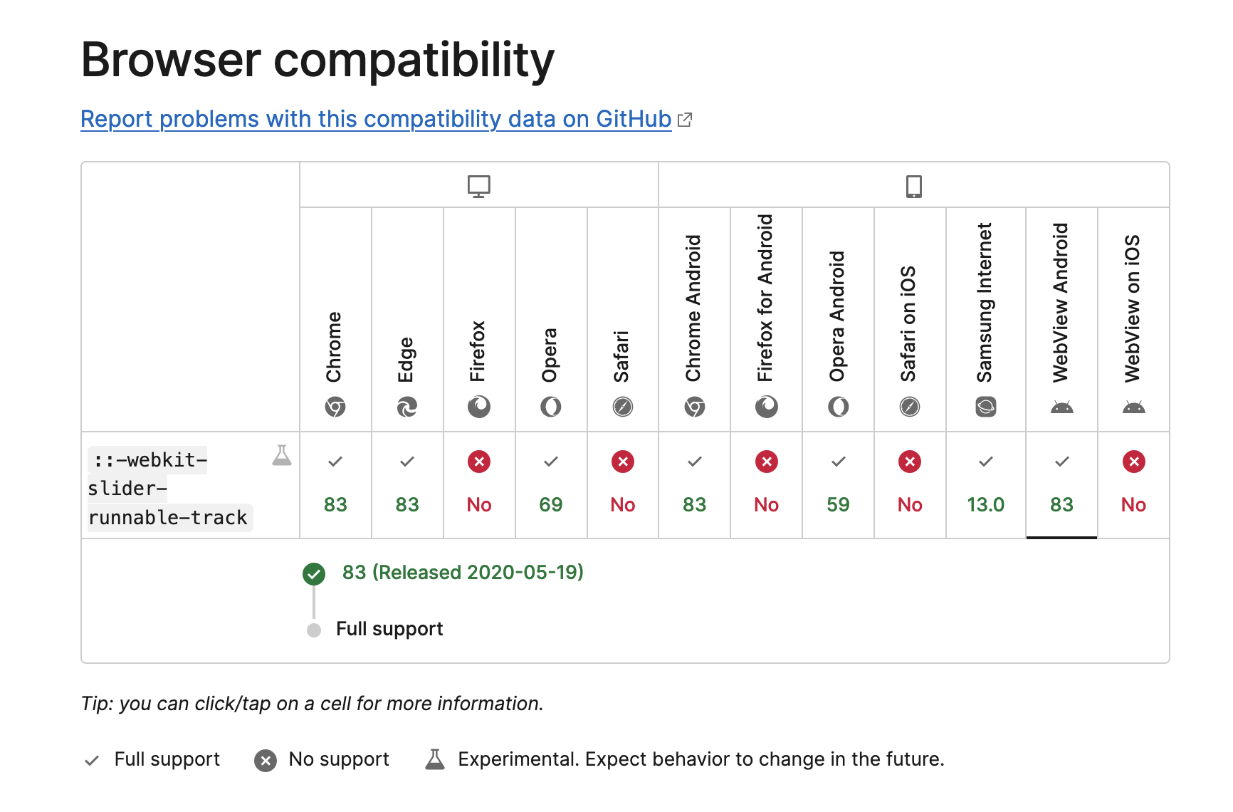
각 브라우저마다 스타일을 입히기 위해선 벤더 프리픽스(vendor prefix)가 붙은 수도 엘리먼트(pseudo element)를 사용해야 한다. 크롬(chrome), 사파리(safari), 엣지(edge) 브라우저의 경우 다음과 같은 엘리먼트가 있다. 크롬은 2020년 5월 이후 버전부터 지원한다.
- ::-webkit-slider-runnable-track
- ::-webkit-slider-thumb
파이어폭스(firefox)는 수도 엘리먼트가 3개다. 프로그레스 바에 대한 스타일이 별도로 가능하다.
- ::-moz-range-track
- ::-moz-range-thumb
- ::-moz-range-progress
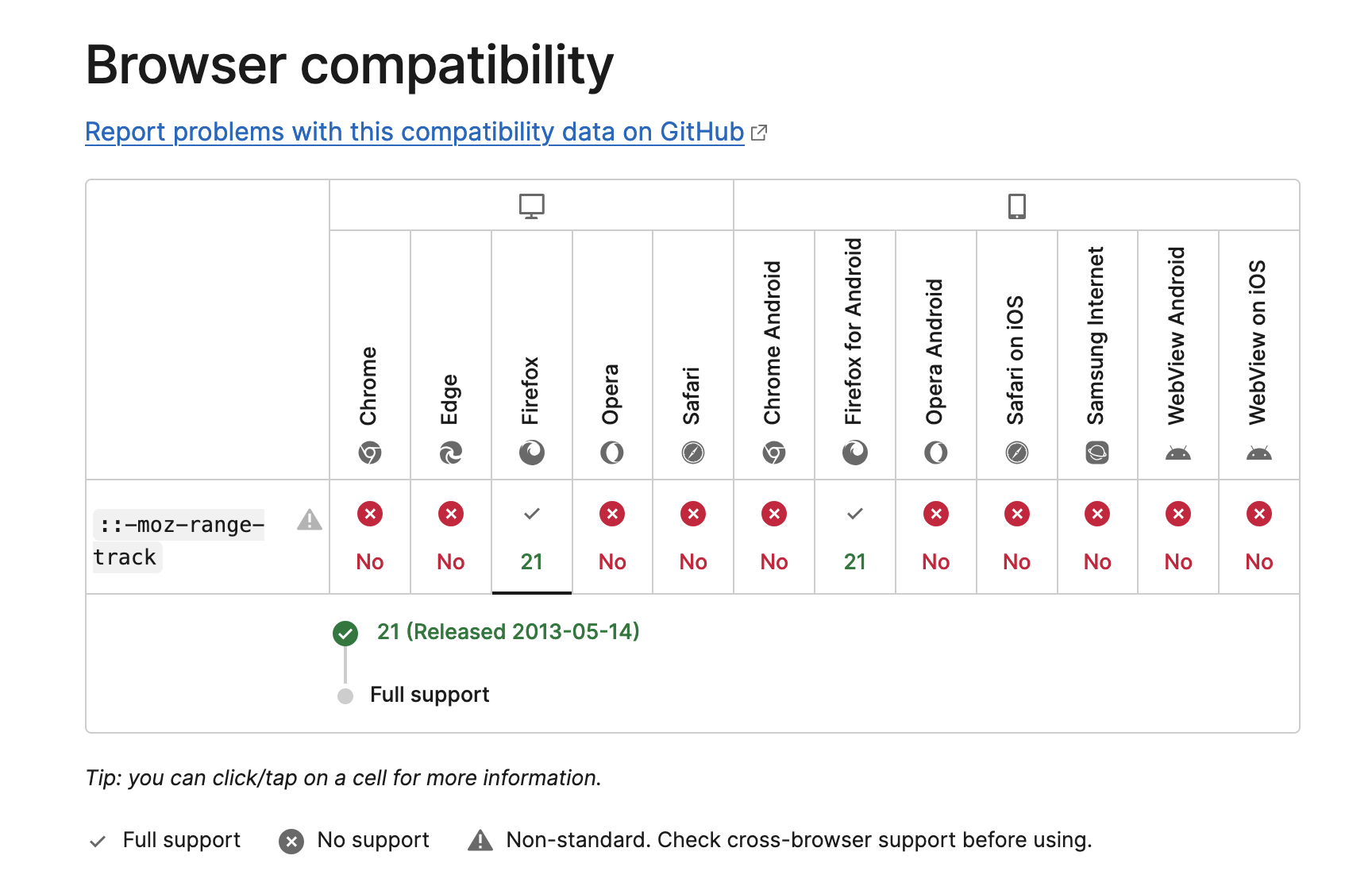
MDN 사이트에서 파이어폭스 관련된 수도 엘리먼트는 표준이 아니라는 경고 메시지를 볼 수 있다. 이를 참고하길 바란다.
Non-standard: This feature is non-standard and is not on a standards track. Do not use it on production sites facing the Web: it will not work for every user. There may also be large incompatibilities between implementations and the behavior may change in the future.
3. Make Style
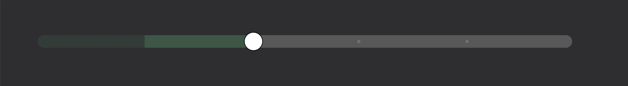
다음과 같은 요구 사항이 있었다.
- 각 스텝(step)마다 색상이 다르다.
- 값 위치에 작은 표시가 있다.
3.1. HTML
코드를 하나씩 살펴보자. 먼저 HTML 코드를 살펴보자.
- 두 개의 레이어를 구성한다.
- dots - 슬라이더 위 표시
- input[type=”range”] - 슬라이더
- 슬라이더는 다음과 같은 상태다.
- value - 초기 값은 1이다.
- step - 각 값 사이 간격은 1이다.
- min - 최소 값은 1이다.
- max - 최대 값은 6이다.
<div class="wrap">
    <div id="dots" class="dots">
        <div class="dot"></div>
        <div class="dot"></div>
        <div class="dot"></div>
        <div class="dot"></div>
    </div>
    <input id="range" type="range" value="1" step="1" min="1" max="6" onchange="changeValue(event)" />
</div>
3.2. CSS
wrap 클래스가 자식 클래스 포지션의 기준이 되도록 position: relative 속성을 지정한다.
body {
    background: #2e2e30;
}

.wrap {
    margin: 50px;
    width: 50%;
    height: 30px;
    display: flex;
    align-items: center;
    position: relative;
}
dots 클래스는 absolute 포지션을 갖는다. z-index: 1 스타일로 슬라이더 위에 표시되도록 한다. 하위 dot 표시들이 균일하게 위치하도록 플렉스 박스(flex box) 정렬을 justify-content: space-evenly;으로 지정한다. dots 레이어는 슬라이더 위에 표시되기 때문에 슬라이더에 대한 마우스 클릭을 방해한다. pointer-events: none 속성으로 클릭 이벤트 대상이 되지 않도록 한다. dot 클래스는 5px 사이즈의 작은 점으로 표시한다.
.dots {
    position: absolute;
    width: 100%;
    height: 100%;
    z-index: 1;
    display: flex;
    justify-content: space-evenly;
    align-items: center;
    pointer-events: none;
}

.dot {
    width: 5px;
    height: 5px;
    border-radius: 50%;
    background: #fff;
    opacity: 0.15;
}
브라우저가 제공하는 기본 스타일을 사용하고 싶지 않다면 appearance: none 속성이 필요하다. height: 20px으로 높이를 설정한다.
#range {
    width: 100%;
    height: 20px;
    border-radius: 10px;
    appearance: none;
}
슬라이더에 대한 스타일을 정의해보자. 크롬, 사파리, 엣지 브라우저는 아래 스타일을 사용한다. 파이어폭스 브라우저와 달리 thumb가 자동으로 트랙 가운데 정렬이 되지 않는다. 트랙과 thumb의 높이를 height: 30px 동일하게 잡아준다. 실제 input 엘리먼트 높이는 20px로 낮게 설정되어 있기 때문에 시각적으로 트랙은 좁게 보인다.
#range::-webkit-slider-runnable-track {
    height: 30px;
    border-radius: 10px;
}

#range::-webkit-slider-thumb {
    appearance: none;
    background: #ffffff;
    cursor: pointer;
    border: 1px solid #000000;
    height: 30px;
    width: 30px;
    border-radius: 50%;
}
파이어폭스는 아래 스타일을 사용한다.
#range::-moz-range-track {
    height: 20px;
    border-radius: 10px;
}

#range::-moz-range-progress {
    height: 20px;
    border-radius: 10px;
}

#range::-moz-range-thumb {
    background: #ffffff;
    cursor: pointer;
    border: 1px solid #000000;
    height: 30px;
    width: 30px;
    border-radius: 50%;
}
각 값마다 스텝의 색상을 정의한다.
.step1 {
    background: #585859;
}

.step2 {
    background: linear-gradient(
        to right,
        rgba(58, 181, 115, 0.1) 0% 20%,
        #585859 20% 100%
    );
}

.step3 {
    background: linear-gradient(
        to right,
        rgba(58, 181, 115, 0.1) 0% 20%,
        rgba(58, 181, 115, 0.3) 20% 40%,
        #585859 40% 100%
    );
}

.step4 {
    background: linear-gradient(
        to right,
        rgba(58, 181, 115, 0.1) 0% 20%,
        rgba(58, 181, 115, 0.3) 20% 40%,
        rgba(58, 181, 115, 0.5) 40% 60%,
        #585859 60% 100%
    );
}

.step5 {
    background: linear-gradient(
        to right,
        rgba(58, 181, 115, 0.1) 0% 20%,
        rgba(58, 181, 115, 0.3) 20% 40%,
        rgba(58, 181, 115, 0.5) 40% 60%,
        rgba(58, 181, 115, 0.8) 60% 80%,
        #585859 80% 100%
    );
}

.step6 {
    background: linear-gradient(
        to right,
        rgba(58, 181, 115, 0.1) 0% 20%,
        rgba(58, 181, 115, 0.3) 20% 40%,
        rgba(58, 181, 115, 0.5) 40% 60%,
        rgba(58, 181, 115, 0.8) 60% 80%,
        rgba(58, 181, 115, 1) 80% 100%
    );
}
각 값마다 dots 레이어에 표시된 dot 클래스 상태를 정의한다.
.dots.step2_dot .dot:nth-child(1) {
    visibility: hidden;
}

.dots.step3_dot .dot:nth-child(1),
.dots.step3_dot .dot:nth-child(2) {
    visibility: hidden;
}

.dots.step4_dot .dot:nth-child(1),
.dots.step4_dot .dot:nth-child(2),
.dots.step4_dot .dot:nth-child(3) {
    visibility: hidden;
}

.dots.step5_dot .dot,
.dots.step6_dot .dot {
    visibility: hidden;
}
3.3. JavaScript
JavaScript 코드로 스타일 제어가 필요하다. 값이 변경될 때마다 dots 레이어와 input 엘리먼트의 스타일을 변경한다.
function changeValue(event) {
    colorChange(event.target);
}

function colorChange(targetElement) {
    const dots = document.getElementById("dots");
    const targetValue = +targetElement.value;
    let className = "step1";
    let dotClassName = "step1_dot";
    switch (targetValue) {
        case 2:
            className = "step2";
            dotClassName = "step2_dot";
            break;
        case 3:
            className = "step3";
            dotClassName = "step3_dot";
            break;
        case 4:
            className = "step4";
            dotClassName = "step4_dot";
            break;
        case 5:
            className = "step5";
            dotClassName = "step5_dot";
            break;
        case 6:
            className = "step6";
            dotClassName = "step6_dot";
            break;
        default:
            break;
    }
    dots.classList.remove(...dots.classList);
    dots.classList.add("dots", dotClassName);
    targetElement.classList.remove(...targetElement.classList);
    targetElement.classList.add(className);
}

const scoreBar = document.getElementById("range");
colorChange(scoreBar);
4. Codepen
전체 코드와 동작은 아래 코드펜에서 확인할 수 있다.
See the Pen Custom slider by Junhyunny (@Junhyunny) on CodePen.
REFERENCE
- https://developer.mozilla.org/en-US/docs/Web/HTML/Element/input/range
- https://fuuno.net/web02/range/range.html
- https://medium.com/hcleedev/web-input-range-%EC%BB%A4%EC%8A%A4%ED%85%80%ED%95%B4-slider-%EB%A7%8C%EB%93%A4%EA%B8%B0-180148968959
- https://developer.mozilla.org/en-US/docs/Web/CSS/::-webkit-slider-runnable-track
- https://developer.mozilla.org/en-US/docs/Web/CSS/::-moz-range-track
댓글남기기